
Every best-selling fonts collection tells a story of what visuals resonate most with designers and brands today. From nostalgic retro bundles to sleek futuristic types, the styles below have earned global attention and carry unique strengths and weaknesses to consider when choosing the right font for your next project.
The Retro and Vintage Font Bundle is a commercial pack featuring 31 fonts across 17 families, and its layered versatility is why it’s a top pick on PutraCetol. Its mix of serif, script, and slab styles suits logos, poster work, and merchandise that need nostalgic impact. However, it can feel overused if not paired thoughtfully or matched with unique graphics. Use this bundle when you want instant retro authenticity but avoid relying on it for original branding unless you customize further.

Pros:
Cons:
Ideal For: Logos, vintage-themed ads, packaging.
Travino Display is one of the most popular free display fonts, widely downloaded for its sharp, modern appeal. It brings a clean, futuristic aesthetic to branding, posters, and websites. Yet, its angular form could feel too sharp or cold in soft brand projects, and lacks stylistic alternatives. Choose Travino when you want sleek minimalism, but pair it carefully with softer visuals to avoid a sterile feel.

Pros:
Cons:
Ideal For: Tech branding, modern editorial layouts, poster headlines.
Cyber Aliens is all about futuristic vibes with slice-style letter detail. Popular among gaming channels and tech projects, it looks dynamic and edgy. On the downside, the slicing effect reduces readability, especially at smaller sizes. Use it for hero text or animation titles, but keep body content simple.
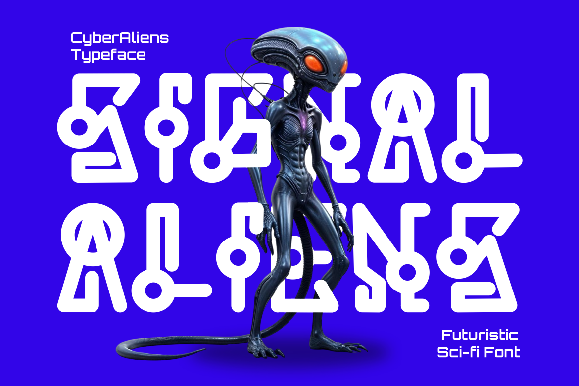
Pros:
Cons:
Ideal For: Gaming channels, tech videos, sci‑fi posters.
De Rolande is an elegant thin sans serif downloaded over 21,000 times on Dafont appreciated for its refined minimalism. Its narrow letter spacing suits high-end branding and editorial work. But the thin lines can disappear on low-res displays or print. Reserve De Rolande for crisp digital layouts or luxury print, and avoid use in low-contrast environments.

Pros:
Cons:
Ideal For: Editorial branding, fashion websites, minimalist designs.
Vintage King brings bold, groovy curves ideal for vintage logos and retro packaging. With over 1.26 million downloads, it has massive appeal. That popularity also brings a risk of resembling other retro-styled works. Its bold weight can leave tight layouts cramped. Choose Vintage King when you want strong vintage flair, but tweak spacing and pairing to avoid blending in.
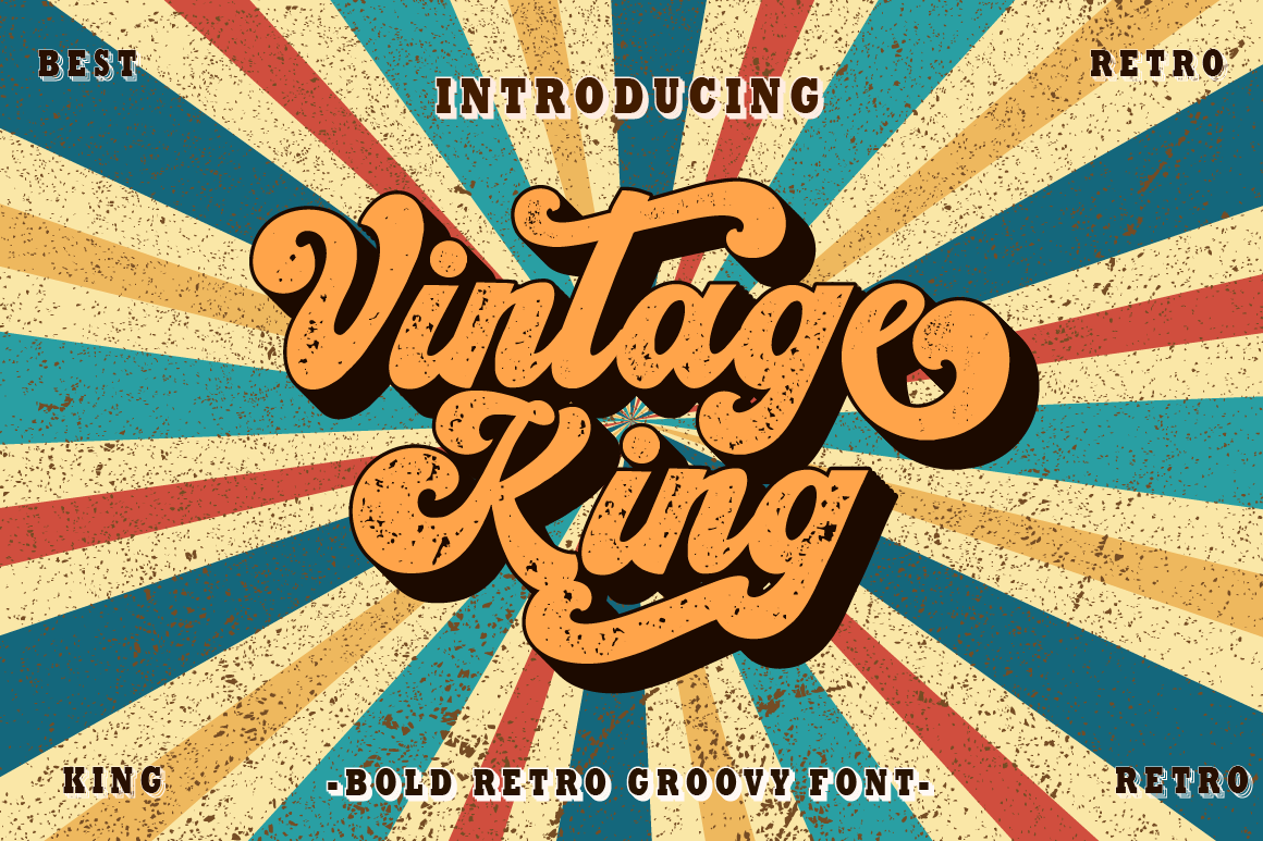
Pros:
Cons:
Ideal For: Logo marks, posters, retro brand packaging.
Faldith is a graceful calligraphy font used widely in branding, invitations, and social content, over 24,000 downloads on Dafont. Its sweeping curves feel warm and personal. However, its decorative form limits text length and can lose clarity at small sizes. Use it for logos or headers, not in longer copy.

Pros:
Cons:
Ideal For: Branding, invitation headings, social graphics.
Street Explorer brings bold, urban energy with over 96,000 downloads on FontSpace. It’s a go-to for streetwear and youth culture branding. Its aggressiveness can dominate refined designs, though, and it might not suit formal branding. Only go Street Explorer when designing for bold, youthful, or gritty visual stories.
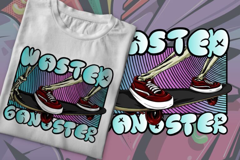
Pros:
Cons:
Ideal For: Streetwear, youth campaign headers, skate promo.
Euphoria Party drips festive, whimsical energy through psychedelic curves. It’s perfect for party promotions or retro-themed events. That flamboyance, however, can make it hard to pair with serious content and its scale can make it unwieldy in longer text. Use Euphoria Party for event titles or fun audio visuals and pair it with minimal backgrounds.
Pros:
Cons:
Ideal For: Party invites, event headers, music promo.
Each of the best-selling fonts above meets a specific visual need retro warmth, futuristic edge, or elegant simplicity. They’re popular because they solve real design challenges across industries and formats and they arrive ready for quick implementation. Still, the strongest results come from pairing them thoughtfully, adjusting scale, and aligning them with your project’s tone and brand voice.
Thank you for taking the time to read this article. If you are looking for more great articles, feel free to visit Putracetol Blog
Additionally, if you want to explore some free typography options, you can check out Putracetol Studio on Dafont. Happy reading and designing!
